

Model Evaluation in PyMC-Marketing#
This notebook demonstrates how to evaluate Marketing Mix Models using PyMC-Marketing’s evaluation metrics and functions. We’ll cover:
Standard evaluation metrics (RMSE, MAE, MAPE)
Normalized metrics (NRMSE, NMAE)
Calculating and visualizing metric distributions and summaries of those distributions
Creating evaluation plots (prior vs posterior plots)
First, let’s import the necessary libraries:
import arviz as az
import arviz_plots as azp
import matplotlib.pyplot as plt
import numpy as np
import pandas as pd
import xarray as xr
from sklearn.metrics import (
    root_mean_squared_error,
)

from pymc_marketing.mmm import (
    GeometricAdstock,
    LogisticSaturation,
)
from pymc_marketing.mmm.evaluation import (
    calculate_metric_distributions,
    compute_summary_metrics,
    summarize_metric_distributions,
)
from pymc_marketing.mmm.mmm import MMM

az.style.use("arviz-darkgrid")
plt.rcParams["figure.figsize"] = [12, 7]
plt.rcParams["figure.dpi"] = 100

%load_ext autoreload
%autoreload 2
%config InlineBackend.figure_format = "retina"
seed: int = sum(map(ord, "mmm-evaluation"))
rng: np.random.Generator = np.random.default_rng(seed=seed)
hdi_prob: float = 0.89  # change this to whatever HDI you want
Setting up a Demo Model#
Let’s first create a simple MMM model using the example dataset:
# Load example data
data_url = "https://raw.githubusercontent.com/pymc-labs/pymc-marketing/main/data/mmm_example.csv"
data = pd.read_csv(data_url, parse_dates=["date_week"])

X = data.drop("y", axis=1)
y = data["y"]

# Create and fit the model
mmm = MMM(
    adstock=GeometricAdstock(l_max=8),
    saturation=LogisticSaturation(),
    date_column="date_week",
    target_column="y",
    channel_columns=["x1", "x2"],
    control_columns=[
        "event_1",
        "event_2",
        "t",
    ],
    yearly_seasonality=2,
)

fit_kwargs = {
    "tune": 1_500,
    "chains": 4,
    "draws": 2_000,
    "target_accept": 0.92,
    "random_seed": rng,
}

mmm.build_model(
    X,
    y,
)
mmm.add_original_scale_contribution_variable(
    var=["y", "channel_contribution"],
)

_ = mmm.fit(X, y, **fit_kwargs)

mmm.plot_suite = "new"

# Generate posterior predictive samples
posterior_preds = mmm.sample_posterior_predictive(X, random_seed=rng)
NUTS[nutpie]: [adstock_alpha, saturation_lam, saturation_beta, y_sigma, gamma_fourier, gamma_control, intercept_contribution]
Sampling: [y]
Understanding the Evaluation Metrics#
PyMC-Marketing provides several metrics for evaluating your models:
Standard metrics from scikit-learn:
RMSE (Root Mean Squared Error)
MAE (Mean Absolute Error)
MAPE (Mean Absolute Percentage Error)
Bayesian R-Squared (from
arviz.az.r2_score)Normalized metrics:
NRMSE (Normalized Root Mean Squared Error), such as is used by Robyn
NMAE (Normalized Mean Absolute Error)
Let’s calculate these metrics for our model:
# Calculate metrics for all posterior samples
results = compute_summary_metrics(
    y_true=mmm.y,
    y_pred=posterior_preds.y_original_scale.to_numpy(),
    metrics_to_calculate=[
        "r_squared",
        "rmse",
        "nrmse",
        "mae",
        "nmae",
        "mape",
    ],
    hdi_prob=hdi_prob,
)

# Print results in a formatted way
for metric, stats in results.items():
    print(f"\n{metric.upper()}:")
    for stat, value in stats.items():
        print(f"  {stat}: {value:.4f}")
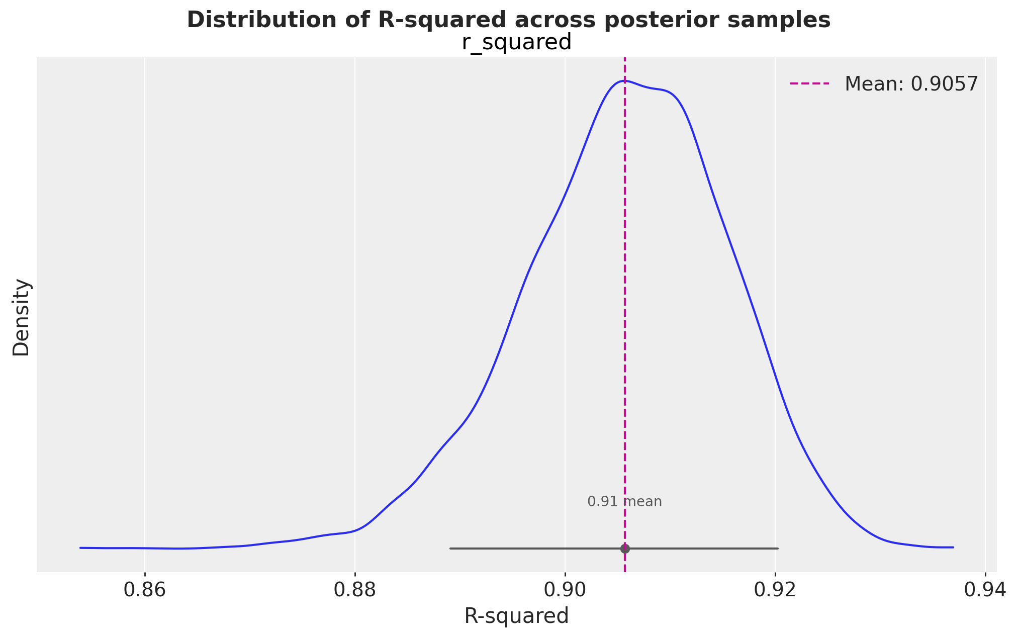
R_SQUARED:
  mean: 0.9057
  median: 0.9062
  std: 0.0098
  min: 0.8538
  max: 0.9370
  89%_hdi_lower: 0.8904
  89%_hdi_upper: 0.9213

RMSE:
  mean: 351.4836
  median: 350.9823
  std: 19.2590
  min: 289.0595
  max: 430.1697
  89%_hdi_lower: 319.9010
  89%_hdi_upper: 380.8287

NRMSE:
  mean: 0.0687
  median: 0.0686
  std: 0.0038
  min: 0.0565
  max: 0.0840
  89%_hdi_lower: 0.0625
  89%_hdi_upper: 0.0744

MAE:
  mean: 281.5021
  median: 280.8876
  std: 16.3966
  min: 225.9541
  max: 349.5408
  89%_hdi_lower: 255.8107
  89%_hdi_upper: 307.4266

NMAE:
  mean: 0.0550
  median: 0.0549
  std: 0.0032
  min: 0.0441
  max: 0.0683
  89%_hdi_lower: 0.0500
  89%_hdi_upper: 0.0600

MAPE:
  mean: 0.0556
  median: 0.0556
  std: 0.0033
  min: 0.0438
  max: 0.0696
  89%_hdi_lower: 0.0505
  89%_hdi_upper: 0.0609
compute_summary_metrics actually combines the steps of two other functions:
calculate_metric_distributionssummarize_metric_distributions
The metric distributions (unsummarised) can sometimes be useful on their own, e.g. if you’d like to visualise the distribution of a metric.
# Calculate distributions for multiple metrics
metric_distributions = calculate_metric_distributions(
    y_true=mmm.y,
    y_pred=posterior_preds.y_original_scale.to_numpy(),
    metrics_to_calculate=["rmse", "mae", "r_squared"],
)

# Summarize the distributions
summaries = summarize_metric_distributions(metric_distributions, hdi_prob=0.89)

# Create a nice display of the summaries
for metric, summary in summaries.items():
    print(f"\n{metric.upper()} Summary:")
    print(f"  Mean: {summary['mean']:.4f}")
    print(f"  Median: {summary['median']:.4f}")
    print(f"  Standard Deviation: {summary['std']:.4f}")
    print(
        f"  89% HDI: [{summary['89%_hdi_lower']:.4f}, {summary['89%_hdi_upper']:.4f}]"
    )
RMSE Summary:
  Mean: 351.4836
  Median: 350.9823
  Standard Deviation: 19.2590
  89% HDI: [319.9010, 380.8287]

MAE Summary:
  Mean: 281.5021
  Median: 280.8876
  Standard Deviation: 16.3966
  89% HDI: [255.8107, 307.4266]

R_SQUARED Summary:
  Mean: 0.9057
  Median: 0.9062
  Standard Deviation: 0.0098
  89% HDI: [0.8904, 0.9213]
# Visualise the distribution of R-squared
pc = azp.plot_dist(
    xr.Dataset(
        {"r_squared": xr.DataArray(metric_distributions["r_squared"], dims=["sample"])}
    ),
    sample_dims=["sample"],
    figure_kwargs={"figsize": (10, 6)},
)
fig = pc.viz["/"]["figure"].values.item()
ax = fig.axes[0]
ax.axvline(
    summaries["r_squared"]["mean"],
    color="C3",
    linestyle="--",
    label=f"Mean: {metric_distributions['r_squared'].mean():.4f}",
)
ax.set_xlabel("R-squared")
ax.set_ylabel("Density")
ax.legend()
fig.suptitle(
    "Distribution of R-squared across posterior samples",
    fontsize=16,
    fontweight="bold",
    y=1.03,
);
Understanding Metric Distributions in Bayesian Models#
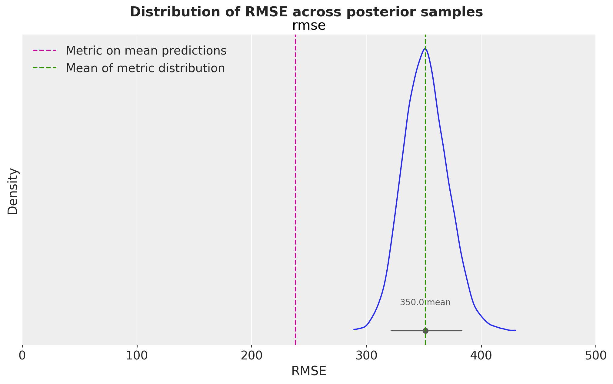
In Bayesian modeling, we tend to work with distributions rather than point estimates. This is particularly important for model evaluation metrics because:
E[f(x)] is not guaranteed to be f(E[x]): This means calculating metrics on mean predictions can give different (and potentially misleading) results compared to calculating the distribution of metrics across posterior samples.
Uncertainty Quantification: Having distributions of metrics allows us to understand the uncertainty in our model’s performance.
Let’s demonstrate this with an example:
# Wrong way: Calculate metrics using mean predictions
mean_predictions = posterior_preds.y_original_scale.mean(axis=1)
naive_rmse = root_mean_squared_error(mmm.y, mean_predictions)

# Correct way: Calculate distribution of metrics
metric_distributions = calculate_metric_distributions(
    y_true=mmm.y,
    y_pred=posterior_preds.y_original_scale,
    metrics_to_calculate=["rmse"],
)

proper_rmse_mean = metric_distributions["rmse"].mean()

print(f"RMSE calculated on mean predictions: {naive_rmse:.4f}")
print(f"Mean of RMSE distribution: {proper_rmse_mean:.4f}")

# Visualize the RMSE distribution
pc = azp.plot_dist(
    xr.Dataset({"rmse": xr.DataArray(metric_distributions["rmse"], dims=["sample"])}),
    sample_dims=["sample"],
    figure_kwargs={"figsize": (10, 6)},
)
fig = pc.viz["/"]["figure"].values.item()
ax = fig.axes[0]
ax.axvline(naive_rmse, color="C3", linestyle="--", label="Metric on mean predictions")
ax.axvline(
    proper_rmse_mean, color="C2", linestyle="--", label="Mean of metric distribution"
)
ax.set_xlabel("RMSE")
ax.set_ylabel("Density")
ax.legend()
fig.suptitle(
    "Distribution of RMSE across posterior samples",
    fontsize=16,
    fontweight="bold",
    y=1.03,
);
RMSE calculated on mean predictions: 238.0848
Mean of RMSE distribution: 351.4836
Comparing Prior vs Posterior Distributions#
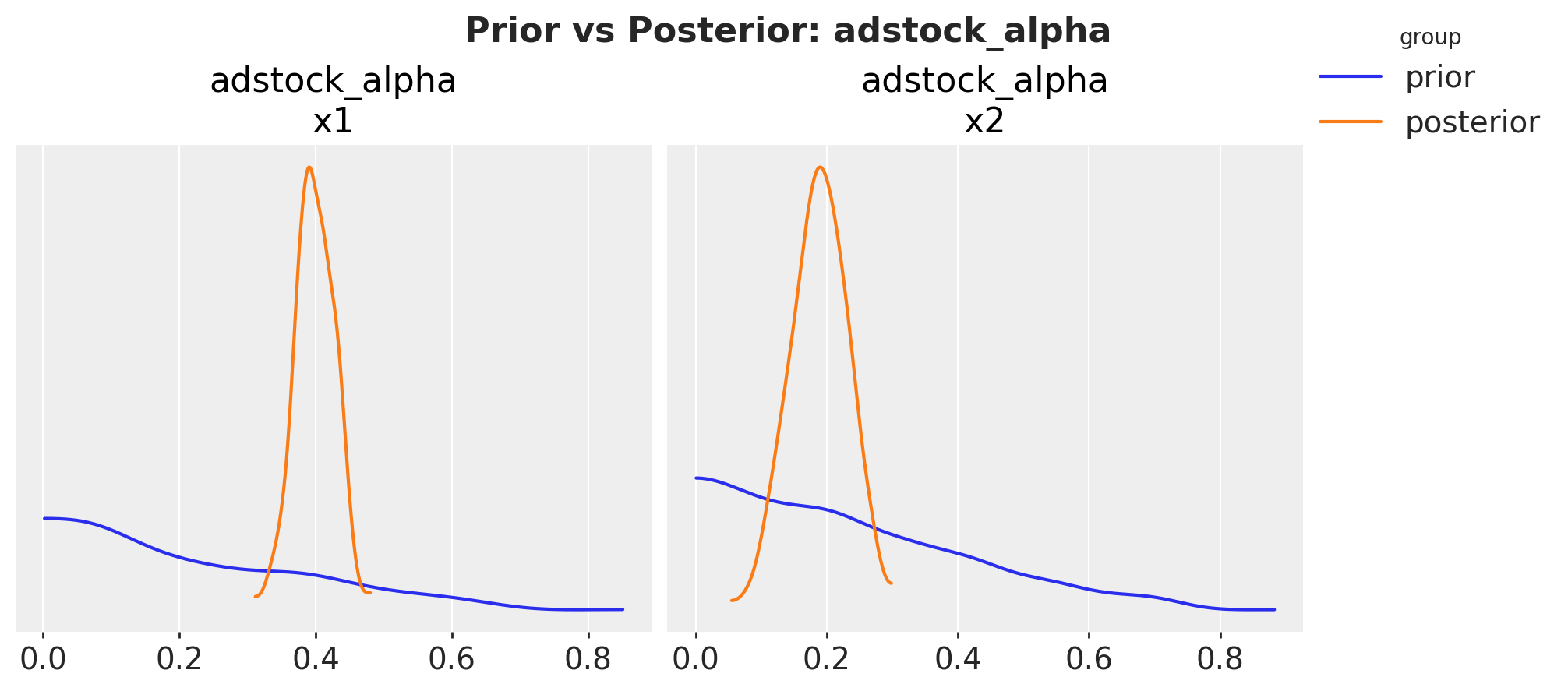
We can also visualize how our prior beliefs compare to the posterior distributions using the plot_prior_vs_posterior method:
# First, sample from the prior
prior_preds = mmm.sample_prior_predictive(X, random_seed=rng)

# Plot prior vs posterior for adstock parameter
fig, axes = mmm.plot.diagnostics.prior_vs_posterior(
    var_names=["adstock_alpha"], figure_kwargs={"figsize": (10, 4)}
)
fig.suptitle(
    "Prior vs Posterior: adstock_alpha", fontsize=16, fontweight="bold", y=1.07
)
Sampling: [adstock_alpha, gamma_control, gamma_fourier, intercept_contribution, saturation_beta, saturation_lam, y, y_sigma]
Text(0.5, 1.07, 'Prior vs Posterior: adstock_alpha')
# Plot prior vs posterior for saturation parameter
fig, axes = mmm.plot.diagnostics.prior_vs_posterior(
    var_names=["saturation_beta"], figure_kwargs={"figsize": (10, 4)}
)
fig.suptitle(
    "Prior vs Posterior: saturation_beta", fontsize=16, fontweight="bold", y=1.07
);
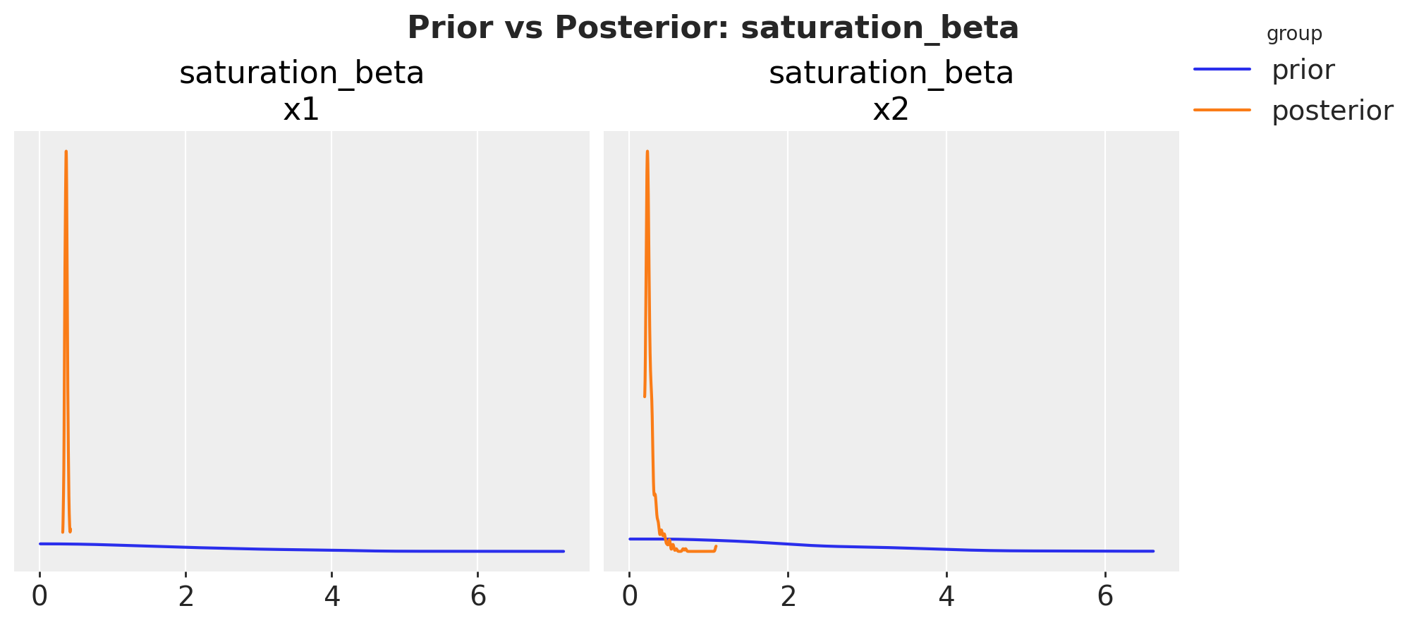
These visualizations help us understand:
How much we learned from the data (difference between prior and posterior)
The uncertainty in our parameter estimates (width of the distributions)
Whether our priors were reasonable (by comparing prior and posterior ranges)
The plot.prior_vs_posterior method allows us to sort channels either alphabetically or by the magnitude of change from prior to posterior, helping identify which channels had the strongest updates from the data.
Conclusion#
In this notebook, we’ve demonstrated how to:
Calculate various evaluation metrics for your MMM including normalized versions (NRMSE, NMAE), as both summaries and distributions
Visualize metric distributions for a chosen evaluation metric
Compare prior vs posterior distributions for different metrics
These tools help us understand model performance and uncertainty in our predictions, which is crucial for making informed marketing decisions.
%load_ext watermark
%watermark -n -u -v -iv -w -p pymc_marketing,pytensor
Last updated: Tue, 30 Jun 2026

Python implementation: CPython
Python version       : 3.14.2
IPython version      : 9.14.0

pymc_marketing: 1.0.0.dev0
pytensor      : 3.0.5

arviz         : 1.2.0
arviz_plots   : 1.2.0
matplotlib    : 3.10.9
numpy         : 2.4.6
pandas        : 2.3.3
pymc_marketing: 1.0.0.dev0
sklearn       : 1.9.0
xarray        : 2026.4.0

Watermark: 2.6.0